개발한 것/배운 것
vanilla Javascript 30days 프로젝트 - 05. Flex Panel Gallery (CSS flexbox + JS 연습)
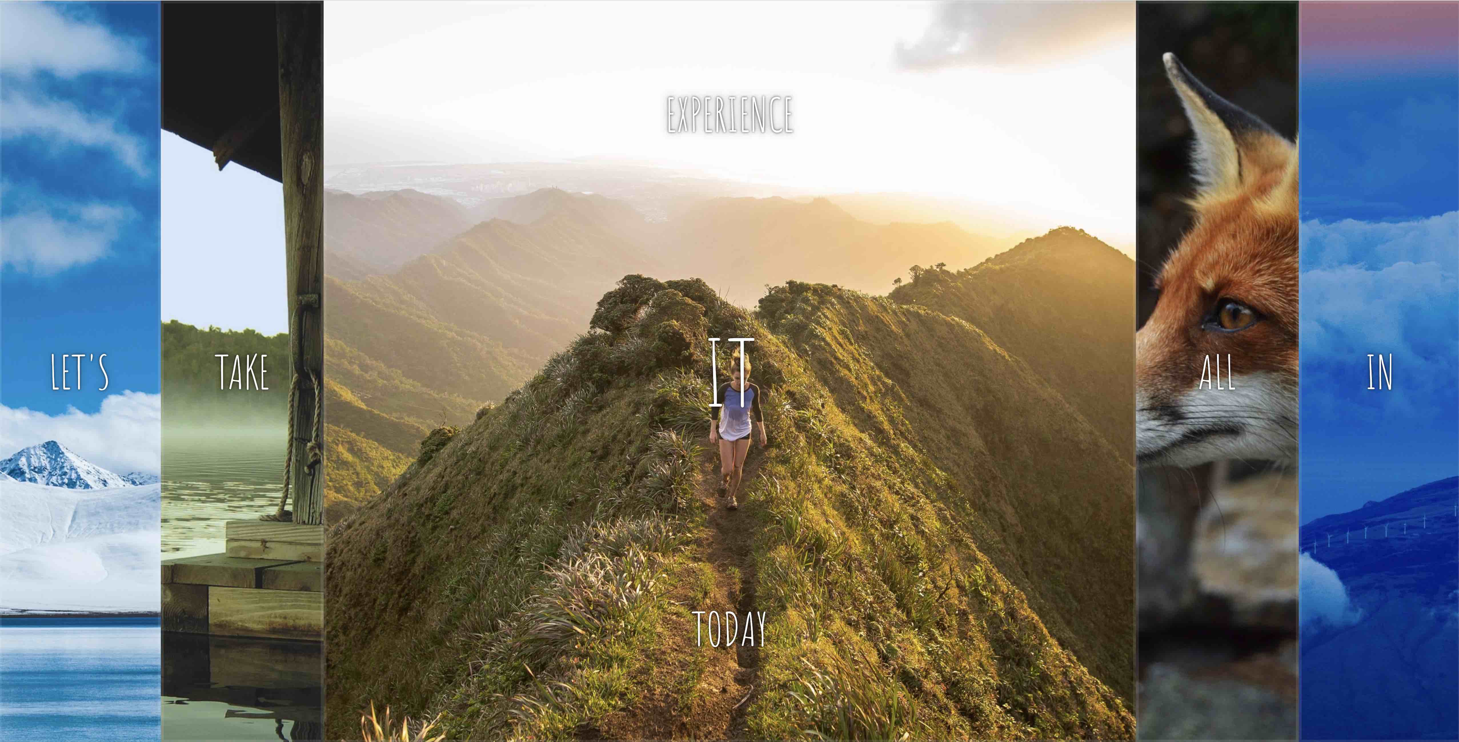
개요 : 특정 패널을 클릭시 flexbox를 활용하여 설정해둔 CSS가 적용+오픈되는 인터랙티브 웹페이지
HTML + CSS
더보기
<!DOCTYPE html>
<html lang="en">
  <head>
    <meta charset="UTF-8" />
    <meta name="viewport" content="width=device-width, initial-scale=1.0" />
    <title>Flex Panels</title>
    <link
      href="https://fonts.googleapis.com/css?family=Amatic+SC"
      rel="stylesheet"
      type="text/css"
    />
  </head>
  <body>
    <style>
      html {
        box-sizing: border-box;
        background: #ffc600;
        font-family: "helvetica neue";
        font-size: 20px;
        font-weight: 200;
      }

      body {
        margin: 0;
      }

      *,
      *:before,
      *:after {
        box-sizing: inherit;
      }

      .panels {
        min-height: 100vh;
        overflow: hidden;
        display: flex;
      }

      .panel {
        background: #6b0f9c;
        box-shadow: inset 0 0 0 5px rgba(255, 255, 255, 0.1);
        color: white;
        text-align: center;
        align-items: center;
        /* Safari transitionend event.propertyName === flex */
        /* Chrome + FF transitionend event.propertyName === flex-grow */
        transition: font-size 0.7s cubic-bezier(0.61, -0.19, 0.7, -0.11),
          flex 0.7s cubic-bezier(0.61, -0.19, 0.7, -0.11), background 0.2s;
        font-size: 20px;
        background-size: cover;
        background-position: center;
        flex: 1;
        display: flex;
        justify-content: center;
        align-items: center;
        flex-direction: column;
      }

      .panel1 {
        background-image: url(https://source.unsplash.com/gYl-UtwNg_I/1500x1500);
      }
      .panel2 {
        background-image: url(https://source.unsplash.com/rFKUFzjPYiQ/1500x1500);
      }
      .panel3 {
        background-image: url(https://images.unsplash.com/photo-1465188162913-8fb5709d6d57?ixlib=rb-0.3.5&q=80&fm=jpg&crop=faces&cs=tinysrgb&w=1500&h=1500&fit=crop&s=967e8a713a4e395260793fc8c802901d);
      }
      .panel4 {
        background-image: url(https://source.unsplash.com/ITjiVXcwVng/1500x1500);
      }
      .panel5 {
        background-image: url(https://source.unsplash.com/3MNzGlQM7qs/1500x1500);
      }

      /* Flex Children */
      .panel > * {
        margin: 0;
        width: 100%;
        transition: transform 0.5s;
        flex: 1 0 auto;
        display: flex;
        justify-content: center;
        align-items: center;
      }

      .panel > *:first-child {
        transform: translateY(-100%);
      }

      .panel.open-active > *:first-child {
        transform: translateY(0);
      }

      .panel > *:last-child {
        transform: translateY(100%);
      }

      .panel.open-active > *:last-child {
        transform: translateY(0);
      }

      .panel p {
        text-transform: uppercase;
        font-family: "Amatic SC", cursive;
        text-shadow: 0 0 4px rgba(0, 0, 0, 0.72), 0 0 14px rgba(0, 0, 0, 0.45);
        font-size: 2em;
      }

      .panel p:nth-child(2) {
        font-size: 4em;
      }

      .panel.open {
        flex: 5;
        font-size: 40px;
      }
    </style>

    <div class="panels">
      <div class="panel panel1">
        <p>Hey</p>
        <p>Let's</p>
        <p>Dance</p>
      </div>
      <div class="panel panel2">
        <p>Give</p>
        <p>Take</p>
        <p>Receive</p>
      </div>
      <div class="panel panel3">
        <p>Experience</p>
        <p>It</p>
        <p>Today</p>
      </div>
      <div class="panel panel4">
        <p>Give</p>
        <p>All</p>
        <p>You can</p>
      </div>
      <div class="panel panel5">
        <p>Life</p>
        <p>In</p>
        <p>Motion</p>
      </div>
    </div>
  </body>
</html>
1. Flexbox 연습
- Panel 그룹 클래스인 panels, 개별 panel 클래스, panel 내부의 아이템들 (.panel > *)에 모두 display : flex 설정 (flex display를 적용하고자 하는 아이템들의 부모 클래스에 항상 설정해야함)
- panel 내의 첫번째, 세번째 박스 내 문구를 기본적으로 사라지게 설정 : .panel > *:first-child/last-child : transform : translateY(value)
- translateY는 수직으로 해당 아이템을 이동시키는 CSS 요소
- panel의 클래스에 panel.open-active가 추가됐을 때 다시 원래의 수직 위치로 되돌려 놓음 (translateY(0))
Javascript
    <script>
      const panels = document.querySelectorAll(".panel");

      function toggleOpen() {
        this.classList.toggle("open");
      }

      function toggleActive(e) {
        if (e.propertyName.includes("flex")) {
          this.classList.toggle("open-active");
        }
      }

      panels.forEach((panel) => panel.addEventListener("click", toggleOpen));
      panels.forEach((panel) =>
        panel.addEventListener("transitionend", toggleActive)
      );
    </script>
1. panel을 클릭했을 시, 그리고 transition이 끝났을 시에 함수를 실행함
2. transition 이벤트 발생시, 해당 이벤트 내에 flex가 변경되는 사항이 포함되므로, e.propertyName.includes("flex")를 지정하여 해당 요소의 클래스명을 open-active로 변경하는 함수 실행
'프로그래밍' 카테고리의 다른 글
| wecode 사전스터디(8/10) 로그 (0) | 2020.08.10 |
|---|---|
| CSS 공부 사이트 링크 (0) | 2020.08.08 |
| wecode 사전스터디(8/5) 로그 (0) | 2020.08.06 |
| wecode 사전스터디(8/4) 로그 (0) | 2020.08.04 |
| wecode 사전스터디(8/3) 로그 (0) | 2020.08.04 |


댓글